
SaintLouisSoftware

This site only has a single code base for both desktop and mobile. Rather than doing things the old-fashioned way of looking at a user agent and deciding which site to serve a visitor, the site’s designed in such a way that it is intended to look good on a wide range of devices, with different aspect ratios, resolutions, and screen sizes.
If you’re on a computer, try resizing your browser window and scroll up and down to see the different effects at different resolutions, aspect ratios, and levels of scrolling through a page.
Here are some of the modern features that went into this site’s frontend:
- HTML5
- CSS3
- Media queries
- Modal boxes
- Image lightboxes
- Collapsable hamburger menu
- Sticky navbar
- Responsive design
- Bootstrap classes
- Responsive columns and rows with breakpoints
- Transitions
- Fluid images
- Hidden overflow images (for a different visual effect)
- Quote boxes
- Carousels
- Glyph icons
- JavaScript and jQuery
- Including aesthetically-pleasing fonts rather than being limited by fonts installed on the visitor’s device
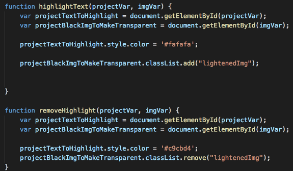
- Visual hints at interactivity, such as lightening or changing the cursor on hover
I eventually want to get more into frontend frameworks such as Angular for making single-page applications (SPAs).
Here’s what I made it with:
- Namecheap for the domain, hosting, and SSL
- cPanel X
- Softaculous
- CloudLinux
- HTML5
- CSS3
- JavaScript
- jQuery
- Bootstrap
- FontAwesome
- Proxima Nova
- Tether
- ShareThis
- Google Analytics
- Disqus
- Open Graph Protocol
- Google Custom Search
- Cloudflare, including caching and security and CDN features
- Various minifiers and compression tools
- PHP
- Google Recaptcha
- Visual Studio Code
- W3 Validator
- Facebook OGP Debugger
- GIMP
- Google AMP
- Pingdom for monitoring site performance and uptime
You can check out the saintlouissoftware.com GitHub repository here.